top of page
Search
  • Writer: lucky
    lucky
  • May 5, 2023
  • 2 min read
ree

Critique:

Balance: The middle light in this photo is perfectly in the centre with an equal number of lights to either side. This gives the photo a very nice clean look that wouldnt be the same if any part of it were different.

I edited this photo on lightroom using my film camera preset that i made last year around this time.

ree

Critique:

Diagonal lines: By taking this photo with my phone tilted slightly on an angle i created a really interesting dynamic that makes the photo much more interesting than if it were taken head on.

This photo (believe it or not) has no editing done to it, just the phone camera and all the lighting from the street lamp.

ree

Critique:

Contrast: By taking this photo on a fence it creates a pattern across the photo. However, in the middle of the photo the pattern is broken by a ball of fire which creates a really cool piece of interest in the composition.

This photo was edited on lightroom using a different preset I made called "brent faiyaz" which tries to replicate some of the photos that brent faiyaz has used of similar style.

ree

Critique:

Breaking the rules: by having the sunject directly in the centre i am breaking the rule of thirds. I feel that having the tree in the centre of the composition actually makes the photo look much better than if the tree were in a third.

This photo was also unedited because it looked so nice on its own that i felt it didnt need anything added to it.

ree

Critique:

Rule of thirds: This photo uses rule of thirds vertically by placing the sign in the top half of the composition. This adds a lot more intrest than if the photo was taken with the sign anywhere else.

To edit this photo I used my film preset on lightroom which makes photos look like they were taken on film.
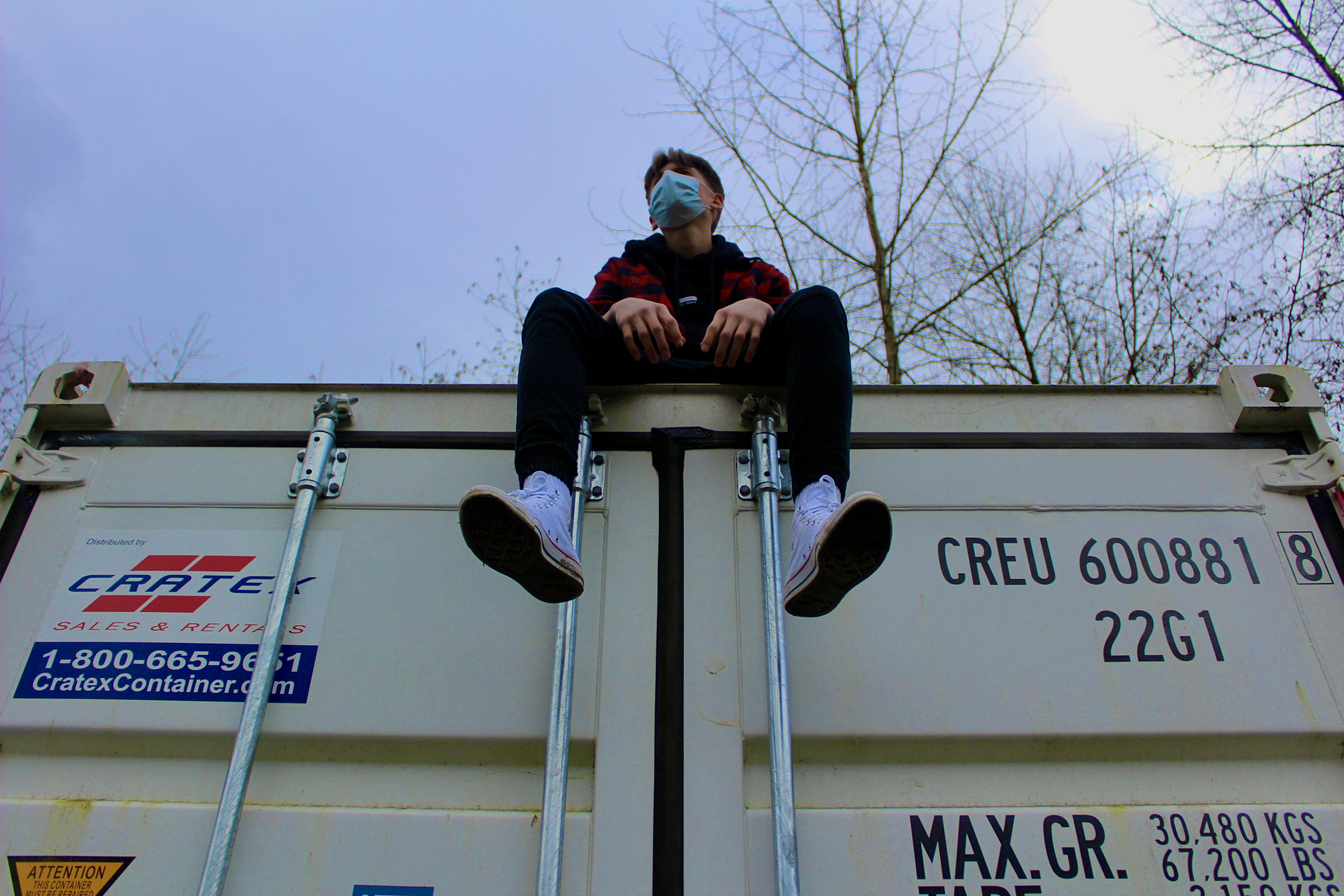
ree

Critique:

Rule of Thirds: this photo is a very good showcase of the rule of thirds because most of the figurative 'weight' in this photo is placed heavily towards one side. This leaves a lot more space in the background to let the background shine through.

This photo, similar to the first and fifth one, uses my film camera preset on lightroom.

ree

Critique:

Texture: this photo is packed full of texture from the overlapping leaves to the fluffy clouds, and the subtle bit of graininess added in post. All this texture creates a lot more intrest to the photo.

This photo, same with most of the photos in this project i used my film camera preset on lightroom. It is definitely my favourite preset ive used and made (if you couldnt tell).

ree

Critique:

Shape: This photo has a very big rectangle as the subject of the photo which creates a very cool balanced feel and makes the building look really large because it takes up a very big portion of the frame.

This photo was once again edited by using my film preset on lightroom which made this photo have a very cool pastel feel almost like a wes anderson movie.


  • Writer: lucky
    lucky
  • Apr 21, 2023
  • 3 min read
ree

Critique:

Rule of thirds: By taking this photo with the subject on the left most third I create an imbalanced feel that pulls the viewers eyes towards the subject.

Contrast: Since I used rule of thirds there is some really cool contrast going on in the background between the brightness coming the light and the darkness that takes up the right half of the frame.

Value: The only colour in this photo comes from the slight yellow hue of the lightbulb and the yellowish tinge of the stand holding it up. This creates a more dramatic photo, whereas, if any of the parts of the photo were a different colour it would end up not looking as good.


ree

Critique:

Diagonal lines: In this photo there is a diagonal line that cuts across the whole composition splitting it in two separate sections. This diagonal line creates a lot of interest opposed to if I took the photo with the line cutting straight through the frame.

Contrast: The contrast in this photo comes from the different colours on the roof, these "different colours" aren't actually colours but shadow and light which perfectly come together in the center of the photo.

Texture: The texture in this photo comes from the fact that this ceiling I took a photo of is an acoustic ceiling. Having the little bumps over the entire photo give it some needed intrest because it would be boring if the ceiling was flat.


ree

Critique:

Rule of Thirds: This photo uses rule of thirds vertically, by leaving a lot of space above the subject, which makes the composition feel more weighted towards the bottom and pulls the viewers eyes down.

Cool Colours: All throught this photo pale blues are used which gives this photo a very cool and dramatic look that wouldnt be the same if I took it on any other day.

Contrast: The slight beam of sunlight that nicely lays itself on the peaks of the mountain gives this photo some nice needed contrast between the cools blues all over the photo and the warm yellowish bit of light that falls over top of the mountain.


ree

Critique:

Warm Colours: By using a yellow-ish light on long exposure it gives the whole photo a yellow tinge, when mixed with all of the browns in the mirror it gives the photo a very warm feel.

Breaking the Rules: By placing the mirror directly in the centre I am breaking the rule of thirds, however, in this photo it works so much better to have me in the centre than on one of the thirds.

Space: By using the white backdrop in the studio and pulling it out all the way to the floor I create a very spacious atmosphere that gives the viewer nothing to look at but the centre of the frame.


ree

Critique:

Rule of Thirds: This photo, similar to my photo of the Golden Ears Mountain, uses rule of thirds vertically. However, this photo has the subject in the top third of the composition which mimicks looking up at the leaf and cuts out the rest of the tree effectively making the photo much more clean and simple.

Cool Colours: This photo uses only the colour blue and green, both colours play very nice with each other and give the photo a very cool feel.

Emphasis: Since the background is one flat colour it really separates the leaf from the background, pulling the veiwers eyes right in and sort of bringing them to the leaf.


ree

Critique:

Texture: This photo has texture all over it, from the rust of the nails, the poorly scratched in graffiti, and the grain of the wood from the table. All of this texture adds a lot of interest to the photo that wouldnt be there wothout it.

Rule of Thirds: The subject of this photo, the nails, are placed in the very top right corner of the photo. This adds a lot of space below the nail that lets the viewers eyes wander.

Contrast: This photo has a very cool colour scheme which is contrasted by the rusty nails that have a darker brown ish colour. This use of contrast helps make the nails pop out from the background.


  • Writer: lucky
    lucky
  • Apr 12, 2023
  • 1 min read
ree

Critique:

Value: I chose to use value in this photo by expanding the range of blacks, whites, and grey colours. In doing that I make the entire picture come together with a complete and dramatic feel.

Emphasis: Since the background of this photo is all black it really pushes me forward in the frame and directs the viewers eyes to the middle of the frame.

Space: This photo uses a lot of negative space in the background of the photo, which separates me and pushes me forward. Which draws the viewers eyes towards me.


ree

Space: Since the moon kind of blends with the background it gives the whole photo a very spacious feel the lets the viewers eyes wander across the frame until they find something tho focus on.

Value: This photo uses very light blues all throughout the photo and doesn't stray from it. Although it doesn't use any dark blues, it still has value and the photo would be very different without it.

Rule of thirds: The subject of this photo, which is the moon, is towards the left third of the frame which creates an imbalanced feel in the composition.


ree

Diagonal lines: By taking this photo from an angle I make it more interesting than if i were to take it straight on from either side.

Unity: This composition feels complete because the spoon and fork are completely in frame and nothing is missing.

Shape: The shape in this photo comes from the square mirror in the centre of the frame whcih the spoon and fork sit on. This shape encloses the subjects and helps pull the eye towards the middle.


bottom of page